Assignment 5
Wednesday, March 16, 2011
Research and Concept
For this assignment, we were supposed to create an infographic based on an article about climate change.
I felt that the usual topics on climate change (e.g. pollution, deforestation, preventive measures) were rather common and overdone. Most people already know about such information, and I wanted to design something that created awareness for a topic with less exposure.
To this end, I actually found an article on the BBC website about how some researchers maintain that humans are not responsible for global warming, and that it is actually a part of natural climate change due to the sun. The idea that nature also contributes to global warming is interesting, but the article absolves humanity of all responsibility, which I found too one-sided and myopic.
Thus, I searched through more articles, and eventually found an interesting one at this link (Discovery News website):
http://news.discovery.com/earth/arctic-carbon-store-warming.html
The main gist of this article is that the Arctic region is naturally a carbon sink (i.e. it absorbs more carbon that it produces, thus reducing global warming effects). This is due to the low rate of decomposition and the frozen, dry conditions in the Arctic. However, with global warming, this is poised to change, due to:
1) Higher rate of decomposition due to higher Arctic temperatures
2) Molten ice and snow cause waterlogged conditions, which encourage the growth of anaerobic bacteria that produce methane (a potent greenhouse gas)
3) Higher risk of bush fires due the lack of permafrost
This all means that instead of being a carbon sink, the Arctic will become a carbon source due to global warming. And this in itself will actually perpetuate the effect of global warming, creating a vicious cycle where nature itself, damaged by climate change, will worsen the process of global warming.
From this idea of a vicious cycle, I thought of the concept of a chain reaction within a machine, and decided to use this as the concept of my design.
Human actions, such as polluting the environment and cutting down trees, are things that we humans can control. Thus, this is similar to a switch that will trigger the process of global warming. More importantly, this is also the part that humans can "turn off" before it's too late.
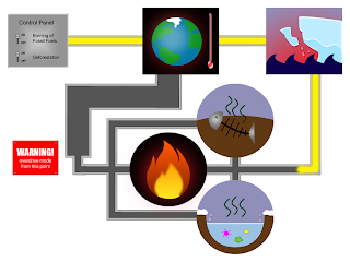
With this in mind, I drew a rough sketch of my infographic. The starting point is a control panel where humans can "toggle" their actions to "on" and "off", signifying our ability to control our own actions, if we want to. The power within the machine then moves to a node that represents global warming, which goes on to activate a node representing the melting of the Arctic region. This then splits into a parallel process of the three effects mentioned above (decomposition, methane-producing bacteria, risk of fire), before combining again and feeding back into the global warming node. The pipe for the final stretch is made wider than the rest, to represent that the reaction will get much bigger due to the chain reaction. Also, once this chain reaction is completed, humans will no longer be able to stop global warming even if they "switch off" their environmentally harmful activities as it will become a self-sufficient loop.
 Rough sketch
Execution
To begin, I first drew images to represent each of the "nodes" in the machine of global warming.
The first item is the control panel representing human actions. This is a simple grey rectangle with switches, each representing a major cause of global warming. I applied a gradient to the rectangle to make it seem more metallic and shiny. I also applied a bevel effect under layer styles to give it a more 3D feel:
 Control panel
Next is the node for global warming. I first drew a simplified cartoon of Earth, surrounding it with a red glow (created using a large soft-edged brush) to signify that it is overheating. I also placed a thermometer next to it to emphasise the high temperature. The glass effect on the thermometer is created using adjustments to layer style (the same technique I used to create tears in Assignment 3; tutorial can be found at http://abduzeedo.com/water-drops-photoshop-5-minutes):
 Global warming
After this, I created an image to represent the melting Arctic. The easiest way to symbolise this is through a melting iceberg. I drew the shape of an iceberg with the pen tool, then used the water/glass layer style adjustments to create a melting section in the top half of the iceberg. I also added a piece of iceberg breaking off from the main portion and some water droplets:
 Arctic melt
Next, I drew the three nodes that represent the three main points I took from the article. These nodes are drawn in circles instead of rectangles in order to contrast with the rest of the design and call attention to them, since they are the main points of the infographic.
 Decomposition
 Methane bacteria
 Fire risk
After some consideration, I also created a warning sign to be placed near the end of the chain reaction, to emphasise a sense of urgency about the dangers of allowing the Arctic to heat up and melt. It uses the same bevel layer style as the control panel, and I also made four studs, one at each corner, to give it the impression of being nailed to the wall:
 Warning sign
I then arranged the various elements and connected them with pipes to show the chain reaction. Since the normal way people read starts from the top left and moves across and down, I set the starting point (the control panel) in the top left and moved right from there. The flow of the pipes will then guide viewers to finish looking at the rest of the items.
Also, I filled part of the network of pipes with some glowing yellow "energy" to show the process of the reaction. The energy stops before the three effects of the Arctic, and the rest of the pipes are empty. This is to put across the message that there is still time for us to stop the process by cutting off the chain reaction from the control panel, but we have to hurry before it gets out of hand and completes the circular loop:
 Connected elements
Lastly, I added in words to provide additional information about the various elements in the design. I formatted the content to tie in with the machine theme of the whole design, placing it in pop-up boxes that point to the element it is explaining. For the font, I used Courier New, which looks like a machine feedback font.
I also added in a heading with a tagline at the bottom, both to improve the composition and to summarise the message of the piece, which is that we have to stop global warming before it is too late, and we no longer have control.
The prototype thus looks like this:
 Prototype
Further Refinements
After presenting my prototype in class, I received the following feedback:
- the direction of the flow of the pipes is not very clear, especially around the global warming node as there are two paths
- the aesthetic quality of some of the individual elements can be improved, especially the one for fire, which is too simplistic
- the green colour of the text boxes does not match with the rest of the design
First, I worked on the picture for fire risk, which is just a single flame on a black background and does not fully convey the idea of bush fires. Thus, I expanded the fire to become a full inferno instead of just a small flame. I also added the blackened silhouettes of trees to signify that it refers to a forest or bush fire. The silhouettes were created by using horizontal brush strokes to roughly fill out the shape of a real forest skyline. The results look like this:

Improved fire risk icon
I also added small arrows to more clearly indicate the flow of the pipes, and changed the text boxes to a slightly greyish blue colour that is more congruent with the rest of the design. The final, refined prototype is thus:
 Refined prototype
posted at
18:29


