FP - Colour Exploration
Sunday, April 10, 2011
Due to time constraints, we did not feel that we would be able to complete over thirty panels in full colour within the tight deadline of the project. Thus, we opted to use monochrome shading for our panels. This has the added advantage of allowing us to fully utilise the mood effects of colour to enhance storytelling.
The colours we explored for this purpose (applied to a sample panel) are as follows:
Blue
This is a clean shade of blue with a high-tech, clinical feel to it. We used this tone to shade the panels occurring in the “clean” outer areas of the factory, as well as the hospital room near the end due to the clean effect it has.

Brown
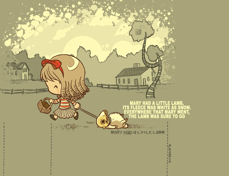
This light shade of brown creates a nostalgic feel, like in old photographs or a memory. We did not feel that this was appropriate for most of our comic. However, we did find a use for this colour in the flashback scenes near the end of our story.

Green
This green gives the scene an artificial, chemical sort of feel, which may be appropriate for a factory setting. However, our main purpose is to contrast the cleanliness of the outside to the dark, dirty surroundings hidden deeper within the factory, so we chose the clean blue instead.

Grey
Grey is fairly neutral in terms of mood. However, it does give a sense of darkness, thus we elected to use this colour scheme for the scenes when the main character first enters the dark, secret areas of the factory.

Red
Scenes shaded in red gain a sense of urgency and impending action. We used this colour to heighten the excitement of the reader during action scenes.

Yellow Green
This sickly yellow-green gives an alien cast to the surroundings and also conveys a feeling of dirtiness. We considered this colour for the panels in which we show mutated creatures and test subjects. However, we felt that it did not fit in with the other colours we were using and would be very jarring.

Cyan
Cyan gives a cool, futuristic sci-fi effect. We considered this for the “clean” areas as well, but decided to use the blue instead as it is less glaring in large amounts and more comfortable to look at.

Dull Yellow
This is quite similar to brown but more neutral, without the nostalgic nuance. We did not really see a need for this colour in our comic.

posted at
18:33