Assignment 5
Wednesday, March 16, 2011
Research and Concept
For this assignment, we were supposed to create an infographic based on an article about climate change.
I felt that the usual topics on climate change (e.g. pollution, deforestation, preventive measures) were rather common and overdone. Most people already know about such information, and I wanted to design something that created awareness for a topic with less exposure.
To this end, I actually found an article on the BBC website about how some researchers maintain that humans are not responsible for global warming, and that it is actually a part of natural climate change due to the sun. The idea that nature also contributes to global warming is interesting, but the article absolves humanity of all responsibility, which I found too one-sided and myopic.
Thus, I searched through more articles, and eventually found an interesting one at this link (Discovery News website):
http://news.discovery.com/earth/arctic-carbon-store-warming.html
The main gist of this article is that the Arctic region is naturally a carbon sink (i.e. it absorbs more carbon that it produces, thus reducing global warming effects). This is due to the low rate of decomposition and the frozen, dry conditions in the Arctic. However, with global warming, this is poised to change, due to:
1) Higher rate of decomposition due to higher Arctic temperatures
2) Molten ice and snow cause waterlogged conditions, which encourage the growth of anaerobic bacteria that produce methane (a potent greenhouse gas)
3) Higher risk of bush fires due the lack of permafrost
This all means that instead of being a carbon sink, the Arctic will become a carbon source due to global warming. And this in itself will actually perpetuate the effect of global warming, creating a vicious cycle where nature itself, damaged by climate change, will worsen the process of global warming.
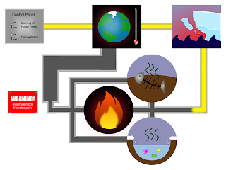
From this idea of a vicious cycle, I thought of the concept of a chain reaction within a machine, and decided to use this as the concept of my design.
Human actions, such as polluting the environment and cutting down trees, are things that we humans can control. Thus, this is similar to a switch that will trigger the process of global warming. More importantly, this is also the part that humans can "turn off" before it's too late.
With this in mind, I drew a rough sketch of my infographic. The starting point is a control panel where humans can "toggle" their actions to "on" and "off", signifying our ability to control our own actions, if we want to. The power within the machine then moves to a node that represents global warming, which goes on to activate a node representing the melting of the Arctic region. This then splits into a parallel process of the three effects mentioned above (decomposition, methane-producing bacteria, risk of fire), before combining again and feeding back into the global warming node. The pipe for the final stretch is made wider than the rest, to represent that the reaction will get much bigger due to the chain reaction. Also, once this chain reaction is completed, humans will no longer be able to stop global warming even if they "switch off" their environmentally harmful activities as it will become a self-sufficient loop.
 Rough sketch
Execution
To begin, I first drew images to represent each of the "nodes" in the machine of global warming.
The first item is the control panel representing human actions. This is a simple grey rectangle with switches, each representing a major cause of global warming. I applied a gradient to the rectangle to make it seem more metallic and shiny. I also applied a bevel effect under layer styles to give it a more 3D feel:
 Control panel
Next is the node for global warming. I first drew a simplified cartoon of Earth, surrounding it with a red glow (created using a large soft-edged brush) to signify that it is overheating. I also placed a thermometer next to it to emphasise the high temperature. The glass effect on the thermometer is created using adjustments to layer style (the same technique I used to create tears in Assignment 3; tutorial can be found at http://abduzeedo.com/water-drops-photoshop-5-minutes):
 Global warming
After this, I created an image to represent the melting Arctic. The easiest way to symbolise this is through a melting iceberg. I drew the shape of an iceberg with the pen tool, then used the water/glass layer style adjustments to create a melting section in the top half of the iceberg. I also added a piece of iceberg breaking off from the main portion and some water droplets:
 Arctic melt
Next, I drew the three nodes that represent the three main points I took from the article. These nodes are drawn in circles instead of rectangles in order to contrast with the rest of the design and call attention to them, since they are the main points of the infographic.
 Decomposition
 Methane bacteria
 Fire risk
After some consideration, I also created a warning sign to be placed near the end of the chain reaction, to emphasise a sense of urgency about the dangers of allowing the Arctic to heat up and melt. It uses the same bevel layer style as the control panel, and I also made four studs, one at each corner, to give it the impression of being nailed to the wall:
 Warning sign
I then arranged the various elements and connected them with pipes to show the chain reaction. Since the normal way people read starts from the top left and moves across and down, I set the starting point (the control panel) in the top left and moved right from there. The flow of the pipes will then guide viewers to finish looking at the rest of the items.
Also, I filled part of the network of pipes with some glowing yellow "energy" to show the process of the reaction. The energy stops before the three effects of the Arctic, and the rest of the pipes are empty. This is to put across the message that there is still time for us to stop the process by cutting off the chain reaction from the control panel, but we have to hurry before it gets out of hand and completes the circular loop:
 Connected elements
Lastly, I added in words to provide additional information about the various elements in the design. I formatted the content to tie in with the machine theme of the whole design, placing it in pop-up boxes that point to the element it is explaining. For the font, I used Courier New, which looks like a machine feedback font.
I also added in a heading with a tagline at the bottom, both to improve the composition and to summarise the message of the piece, which is that we have to stop global warming before it is too late, and we no longer have control.
The prototype thus looks like this:
 Prototype
Further Refinements
After presenting my prototype in class, I received the following feedback:
- the direction of the flow of the pipes is not very clear, especially around the global warming node as there are two paths
- the aesthetic quality of some of the individual elements can be improved, especially the one for fire, which is too simplistic
- the green colour of the text boxes does not match with the rest of the design
First, I worked on the picture for fire risk, which is just a single flame on a black background and does not fully convey the idea of bush fires. Thus, I expanded the fire to become a full inferno instead of just a small flame. I also added the blackened silhouettes of trees to signify that it refers to a forest or bush fire. The silhouettes were created by using horizontal brush strokes to roughly fill out the shape of a real forest skyline. The results look like this:

Improved fire risk icon
I also added small arrows to more clearly indicate the flow of the pipes, and changed the text boxes to a slightly greyish blue colour that is more congruent with the rest of the design. The final, refined prototype is thus:
 Refined prototype
posted at
18:29
Assignment 4
Wednesday, March 9, 2011
Concept
The requirement for this assignment is to design a postcard based on a chosen travel theme. I was quite keen on doing an international theme instead of focussing on a particular country or region. I like animals and interesting architecture, so I considered world wildlife and world architecture as my themes.
Eventually, I settled on architecture as I found it easier to execute. The idea for the design I had in mind was that of a city skyline silhouette made up of famous buildings from around the world.
I wanted buildings from various countries and regions so as to be representative of the whole world. I also wanted to have a mix of both old and new buildings, as the theme is the appreciation of architecture across countries and across different periods of time. The structures that I considered using were:
Asia / Middle East
- Tokyo Tower (Japan)
- Forbidden City (China)
- Oriental Pearl Tower (China)
- Taj Mahal (India)
- Sphinx (Egypt)
Europe
- Saint Paul's Cathedral (Britain)
- Big Ben (Britain)
- Leaning Tower of Pisa (Italy)
- Eiffel Tower (France)
USA
- Empire State Building
- Statue of Liberty
I couldn't fit all of these into one postcard, so I had to shortlist. I eliminated the Sphinx and Statue of Liberty as I'm more interested in functional architecture (buildings), while these two are more like building-sized sculptures. I also removed Eiffel Tower and Tokyo Tower as the two look too similar.
Ultimately, I wanted a good mix of buildings from different countries without too many from one particular region, so I decided on five:
1) Taj Mahal, India; completed in 1643, 35m high
2) Big Ben, Britain; completed in 1858, 96m high
3) Empire State Building, USA, completed in 1931, 381m high
4) Oriental Pearl Building, China, completed in 1994, 468m high
5) Tokyo Sky Tree, Japan, estimated completion in 2011, 634m high
Execution
At first, I thought of drawing the buildings to scale relative to each other, but it wasn't practical as the Tokyo Sky Tree is about 20 times taller than Taj Mahal. So I settled for at least getting the relative heights in order (i.e. Tokyo Sky Tree will be taller than Oriental Pearl, etc).
The first step is to get the building silhouettes. Using reference photographs from the internet, I drew the silhouettes of the five buildings using the brush and pen tools in Photoshop (each building is drawn on a separate layer). I also added in some details in a smaller brush diameter to make the buildings more easily recognisable:

I then arranged the buildings to make the composition less imbalanced. Also, I felt that the space above the shorter buildings was a bit too empty, so I added in the silhouette of a plane (drawn based on reference picture of real plane), which also fits the travel theme. The original colour scheme that I drew this in is a black background with pale yellow lines, resembling a night view of the city skyline:

After this, I proceeded to use the hue/saturation adjustment tool in Photoshop as well as the gradient tool to create 7 other colour schemes for my design:
 This colour scheme is based on the actual colours of the buildings in real life. The Tokyo Sky Tree is primarily blue and grey, so I used blue. The Oriental Pearl is white with dark pink areas on the round portions, so I simplified the colour to just the dark pink. Similarly, I used the actual main colours of the buildings for the other three landmarks as well. The background is light blue, like the sky. This colour scheme gives off a cartoonish feel.
 This colour scheme is just an experimentation with deep, warm colours. I used a gradient of varying shades of red, and I made the lines black. This colour scheme is probably not very appropriate as it gives off a rather sinister feel.
 This colour scheme is an experimentation with strongly contrasting bright colours on a black background. The buildings look like multicoloured glowing neon signs (like those at nightclubs) here, which is an interesting effect. However, my focus is on the architecture, not on the nightlife of the world, so this might not be the best colour scheme to reflect my theme.
 This colour scheme uses two colours of similar shade but different tonal value. The beige/brown shade that I chose gives the design a nostalgic feel, like a sepia photograph. This is one of the colour schemes that I strongly considered for my final prototype.
 Since my theme centres around architecture, I also decided to try a blueprint-style colour scheme. Once again, the background and lines are of similar shade but different value, except the darker tone is in the background instead. The blue that I used, especially for the lines, is quite cold, which makes the design seem a bit stark. Nonetheless, the blueprint idea fits well with my architecture theme, so I considered this for my prototype as well.
 The next colour scheme is a warm, vibrant sunset/sunrise scheme. Scenery with sunset is often considered particularly beautiful, and this ties in with my theme of enjoying the beauty of architecture around the world. The warmth and vibrance of the colours also gives off a romantic feel. I chose this colour scheme for my final prototype.
 An experimentation with the colour green, as I didn't really make use of green in my other colour schemes. I was aiming for a sort of peaceful, zen feel with green and white, but the effect is not quite there.
I then created the back of my postcard, with a box for sticking the stamp and lines to write the receipient's address. I also included a watermark of the city skyline in my design and a short line of text: "See the architectural delights of the world."
My prototype is thus, front and back:

Further Refinements
After presenting my prototype in class, the areas of improvements highlighted to me were:
1) make the plane silhouette smaller as it is stealing attention from the buildings
2) since it is a simplistic design, there is a need to play with line thickness more in order to emphasise the right areas of the design
3) change the aspect ratio of the postcard to make it longer horizontally, to extend the city skyline
I could not really act on the feedback about the lines as I wasn't really sure of how to change the lines to achieve a better effect. Also, it would require me to redraw all the buildings, which will be very time-consuming (I took about 7 hours to finish the original prototype). Thus, it is more of a learning point to consider for similar work in the future.
The other two comments, however, were easier to follow through, so I made improvements based on them. I extended the design horizontally, rearranging the buildings to make them fit better. It also gave me the space to draw more filler buildings for the rest of the city skyline. I also find the positioning of the plane more comfortable in this version. My final prototype is thus:


posted at
15:35
Assignment 3
Thursday, March 3, 2011
For this assignment, the requirement is to use a series of photographs to show a linear story.
I don't have the equipment to take photographs of myself (other than close-up "camwhore" shots), and I didn't want to trouble others to model for me, so I decided to have an inanimate object as the subject of the photographs.
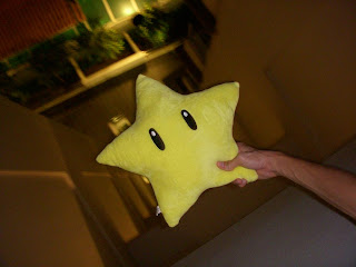
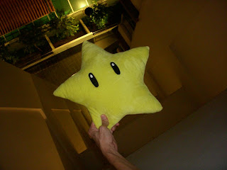
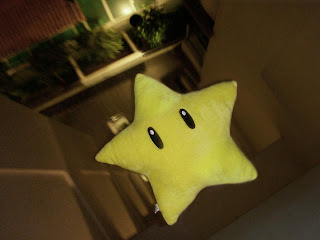
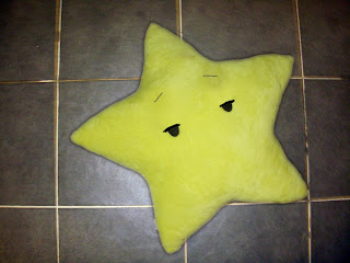
The story that I eventually came up with was inspired partially by the Disney movie "The Princess and the Frog", where a firefly falls in love with a star he sees in the sky. I happen to have a stuffed toy star with rather expressive-looking eyes, so I decided to create a little fantasy story about a toy star that fell in love with a real star in the sky.
I did some rough sketches of the scenes to include, with the sequence numbered:

Scene #1
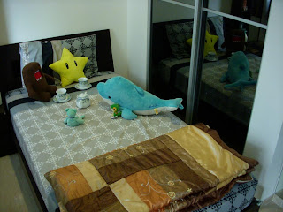
My first scene is an establishing shot, basically saying, "Once upon a time, there was a toy star who lived happily with all its other stuffed toy friends." It shows a bunch of soft toys having a tea party.
The first photo I took for this scene is an over-the-shoulder shot from behind one of the soft toys (the teddy bear), focussing on the star:
 scene 1: over the shoulder
I personally found the shot aesthetically pleasing and liked it a lot, but I also felt that the angle and shot size was not really appropriate for an introductory shot.
I then tried out a bird's eye view shot, showing the tea party from directly above:
 scene 1: bird's eye view
This shot was not very satisfactory in terms of aesthetics, partially because I just stood on a chair, raised the camera above my head and snapped it without being able to see the composition. Also, the scene is supposed to convey the idea of the soft toys having fun, but this shot is very cold and distant, so the cheerful mood doesn't really come through.
Finally, I did a normal long shot, showing the bed with the toys on it:
 scene 1: long shot
This is the shot that I included in my final prototype, after some minor photo editing in Photoshop. The long shot is appropriate for a lead-in, and the shot is not too bad aesthetically as well.
Scene #2
The second panel shows the toy star looking out of the window at night, when its friends are all sleeping in bed.
I tried another long shot for this:
 scene 2: long shot
I didn't find this shot size very appropriate, since the focus of the shot (which is supposed to be the star) is not very obvious.
So, instead, I moved in closer:
 scene 2: mid shot
I found this more appropriate as there is enough environmental information to show the other toys sleeping, while keeping the main focus on the toy star's actions. Thus, this is the shot that I used for my final prototype.
Scene #3
The third panel shows what the star sees through the window, which is a beautiful shining star in the night sky.
I used an over-the-shoulder shot for this:
 scene 3: over the shoulder
I was satisfied with this shot, since it gives the impression of being from the perspective of the toy star. I didn't think a point-of-view shot would be good as removing the star from the scene would break the flow of the story (there's no way to tell that the scene outside is the scene seen from the window).
Scene #4
The fourth panel is intended to show the reaction / emotion of the toy star upon seeing the real star. Since this is the case, shot size pretty much has to be close up. Nonetheless, that still left some room to experiment with angles.
I first tried a low angle shot, to give the viewer the same feeling of looking up as the star:
 scene 4: low angle
However, the effect was not satisfactory. One thing is that the star looks kind of intimidating due to the effect of the low angle. Also, the eyes of the star are not fully visible, so emotion cannot be properly conveyed.
I then tried a high angle shot:
 scene 4: high angle
The eyes are more visible in this shot. However, the star looks kind of scared (due to the vulnerability imposed by the high angle shot). This was not the effect I wanted, since the star was supposed to be falling in love, not being afraid.
So I went for an eye level shot:
 scene 4: eye level
There is a full view of the star's face, which is good for conveying emotion. Also, the audience will be at a comfortable, familiar eye level with the star. This the audience to relate more closely with the star's feelings.
Scene #5
Spurred by its attraction for the real star, the toy star climbs the stars to get closer to it. This is the scene to be captured in the fifth panel.
I wanted to capture the struggle of a little toy star climbing big steps made for humans. There were two ways to do this: make the star seem weaker, or make the stairs seem more intimidating. I tried both:
 scene 5: high angle
 scene 5: low angle
The first high angle shot makes the star seem vulnerable. On the other hand, the low angle shot makes the stairs seem more daunting. Both achieve the effect of making the star's actions seem difficult. After struggling with the decision for a while, I decided on the low angle shot, mainly because the upwards viewing angle conveys more of the star's intention to move upwards.
Scene #6
The sixth scene in the story takes place on the roof of the building, where the toy star jumps out in hopes of reaching the real star. I had a lot of problems with this scene, since I actually had to take it out on the roof at night. The lighting was horrible, and I had a lot of angle problems. For instance, there were issues with the blank white wall surrounding the roof filling up half the shot and making it quite ugly. Also, I needed the star to look like it was jumping OUT while looking UP at the sky. This proved to be very challenging to achieve. The star ended up either weirdly positioned, or looking in the wrong angle.
Some examples of failed shots:
 star looking in the wrong direction
 too much wall
 direction of the star's movement is not clear
Finally, after retaking the shots repeatedly and exhausting my helper, I managed to get this:
Enough sky visible, not too much wall, and the star looks reasonably like it is jumping out off the roof. I didn't think I could get much better after more than an hour of trying, so I settled for this and moved on.
Scene #7
The seventh panel shows a scene of the toy star crying as it falls, unable to fly and reach the real star. For this, I had my helper (who had long arms!) hold the star over the edge of the roof.
On my first try, I got this:
The star's face and the floor below are both visible enough, but the shot looks quite boring and static.
So I tried again, using a slanted dutch angle this time:
 scene 7: dutch angle
The shot turned out looking more dynamic, and there's more of the "topsy turvy" feeling of tumbling down through the air. I also managed to get a nice effect where the background is blurred while the star is in focus, which also gives the feeling of movement.
Scene #8
The eight panel is a shot of the empty floor, implying that the star disappeared after falling. Although the story takes place at night, this shot was taken during the day as it is too dark for the floor to be clearly visible from the roof at night. I took this in a dutch angle as well, to create a slightly confused, jarring effect ("eh? why is the star gone?!"):
 scene 8: dutch angle
Scene #9
The concluding shot shows a happy ending after the suspense of the previous shot. There is a view of the night sky (the same view as when the star looked out the window), and there are now two shining stars in the sky. It is implied that the toy star managed to become a real star and can be together with the star it fell in love with.
For this scene, I took basically the same shot as in Scene #3, except without the toy star in it:
Photo Editing
Having finished taking the raw photographs, I then had to edit for lighting and colour to achieve the effects I wanted. I also had to do some photo manipulation, such as adding in the shining star in the sky and the tears in the toy star's eyes as it falls.
Before I could get to that, however, I faced a big problem with panels 5, 6 and 7. Unlike in the story, the stuffed toy that starred in my photos is not a magical animated toy. My helper had to hold it in position for these shots, and his hand is very clearly visible in the photos.
To solve this, I actually took two photos for each scene, each with my helper's hand in two different positions. To get a photo without his hand, I had to merge the two. I'll use panel 7 as an example. The two raw photos that I had to work with were:
However, there were some complications that made the process a lot more difficult. Firstly, the colours in the two photos are slightly different. The position of the star is also not exactly the same (inevitable, since my helper had to switch hands). Additionally, the background blur effect, which I wanted, occurs only in the first photo but not in the second. To solve these problems, I did the following:
1) adjust the brightness/contrast and hue/saturation of the cropped area (the right section of the second photo) to match the first photo.
2) use clone stamp to blend the cropped area into the first photo
3) select and apply motion blur filter to the background of the cropped area to make it seem blurred like the rest of the first photo
After struggling through the tedious process, I managed to get a passably convincing manipulated photo:
I repeated similar processes for panels 5 and 6 to remove my helper's hand from the picture.
I also had to do some photo manipulation for panels 3, 4, 6, 7 and 9.
For panel 3, the actual stars in the sky were neither big nor bright enough to be captured in my camera, so I had to create an artificial, exaggerated star to make the story clear. To do this, I simply used the soft edge brush to draw a long white vertical line, followed by a shorter horizontal line cutting across its centre, and finally two diagonal lines crisscrossing over the middle (each line is on a separate layer). I then applied motion blur in a parallel angle to each of the four lines, and used the soft edge brush in a bigger diameter to make a "glowing orb" in the centre of the lines. The process looks something like this:
 four straight white lines
 parallel motion blur
 add the "glowing orb" to get a shining star!
I used this technique to create stars for the sky in panels 3, 6 and 9, and also to make sparkles in the toy star's eyes for panel 4. The other edit I did in panel 4 is simple--just drawing pink hearts around the star to indicate it falling in love.
The most complicated manipulation comes in panel 7, which is the star falling. I wanted the star to be crying, so I needed to draw artificial tears. I had a lot of trouble with this, until I found some a detailed video tutorial on the internet about using layer styles to create water droplets.
The tutorial can be found at this URL:
http://abduzeedo.com/water-drops-photoshop-5-minutes
It worked pretty well, and I managed to get water droplets that were quite realistic looking. Additionally, these could be painted on with a brush, so I could edit the shapes of the teardrops to my liking. However, one down side is that the effect is only for small droplets, and making bigger patches creates something that looks like a puddle instead of a teardrop. So I was limited to just making small droplets of tears brimming out of the toy star's eyes.
Final Prototype!
Thus, with all the tedious editing done, the 9 colour-edited and manipulated photos for my final prototype are as follows:
 photo edited for a more vibrant, cheerful feel
 area around the sleeping toys dimmed to place emphasis on the star
 artificial star in sky; artificial "reflection" of star to show that it is looking through window glass
 sparkles in the star's eyes, pink hearts around the head
 manipulated to make star seem like it's climbing stairs by itself
 artificial star in sky; manipulated to make star seem like it's jumping by itself
 artificial teardrops; manipulated to make star seem like it's falling
 darkened to make it seem like night
 artificial stars in sky
"Once upon a time, there was a toy star who lived happily with its other stuffed toy friends. One night, while the other toys were sleeping, the toy star looked out of the window and saw a shining star in the night sky. Enchanted by the real star's beautiful glow, the toy star fell in love. Determined to get closer to the real star, the toy star climbs up the stairs to the roof, where it jumps off, hoping to fly up and reach the real star. However, it was futile, and the toy star sheds tears as it falls to the ground. Suddenly, the toy star disappears from the ground where it fell. And then there were two stars in the sky that night, and they twinkled happily ever after."
Further Refinements
After presenting my prototype in tutorial, I had feedback that panel 8 (the empty floor) was a bit unclear. To make it clearer that the star fell to the ground and then disappeared, it is suggested that I do some further photo manipulation to create a translucent star "fading" away from the ground.
Revising my work while taking this feedback into consideration, I took two new raw shots for panel 8, one of the empty floor and one of my star.
First, I cropped out the toy star and placed it into the photo of the floor. I also used the clone stamp tool to cover part of the star's eyes and make it look like it is dying and semi-conscious after falling to the floor. Eyelashes and eyebrows were drawn into using the brush tool:
After this, I added tears flowing down the star's face:
 Finally, I reduced the opacity of the layers with the star and the tears to make it seem like it is disappearing and fading away. The new version of panel 8 is as follows:
posted at
22:08
 Rough sketch
 Control panel
 Global warming
 Arctic melt
 Decomposition
 Methane bacteria
 Fire risk
 Warning sign
 Connected elements
 Prototype
 Refined prototype

 This colour scheme is based on the actual colours of the buildings in real life. The Tokyo Sky Tree is primarily blue and grey, so I used blue. The Oriental Pearl is white with dark pink areas on the round portions, so I simplified the colour to just the dark pink. Similarly, I used the actual main colours of the buildings for the other three landmarks as well. The background is light blue, like the sky. This colour scheme gives off a cartoonish feel.
 This colour scheme is just an experimentation with deep, warm colours. I used a gradient of varying shades of red, and I made the lines black. This colour scheme is probably not very appropriate as it gives off a rather sinister feel.
 This colour scheme is an experimentation with strongly contrasting bright colours on a black background. The buildings look like multicoloured glowing neon signs (like those at nightclubs) here, which is an interesting effect. However, my focus is on the architecture, not on the nightlife of the world, so this might not be the best colour scheme to reflect my theme.
 This colour scheme uses two colours of similar shade but different tonal value. The beige/brown shade that I chose gives the design a nostalgic feel, like a sepia photograph. This is one of the colour schemes that I strongly considered for my final prototype.
 Since my theme centres around architecture, I also decided to try a blueprint-style colour scheme. Once again, the background and lines are of similar shade but different value, except the darker tone is in the background instead. The blue that I used, especially for the lines, is quite cold, which makes the design seem a bit stark. Nonetheless, the blueprint idea fits well with my architecture theme, so I considered this for my prototype as well.
 The next colour scheme is a warm, vibrant sunset/sunrise scheme. Scenery with sunset is often considered particularly beautiful, and this ties in with my theme of enjoying the beauty of architecture around the world. The warmth and vibrance of the colours also gives off a romantic feel. I chose this colour scheme for my final prototype.
 An experimentation with the colour green, as I didn't really make use of green in my other colour schemes. I was aiming for a sort of peaceful, zen feel with green and white, but the effect is not quite there.


 scene 1: over the shoulder
 scene 1: bird's eye view
 scene 1: long shot
 scene 2: long shot
 scene 2: mid shot
 scene 3: over the shoulder
 scene 4: low angle
 scene 4: high angle
 scene 4: eye level
 scene 5: high angle
 scene 5: low angle
 star looking in the wrong direction
 too much wall
 direction of the star's movement is not clear

 scene 7: dutch angle
 scene 8: dutch angle


 four straight white lines
 parallel motion blur
 add the "glowing orb" to get a shining star!
 photo edited for a more vibrant, cheerful feel
 area around the sleeping toys dimmed to place emphasis on the star
 artificial star in sky; artificial "reflection" of star to show that it is looking through window glass
 sparkles in the star's eyes, pink hearts around the head
 manipulated to make star seem like it's climbing stairs by itself
 artificial star in sky; manipulated to make star seem like it's jumping by itself
 artificial teardrops; manipulated to make star seem like it's falling
 darkened to make it seem like night
 artificial stars in sky

